Falcon Cloud 3.3
UX Improvements for a 3D simulation platform to achieve user growth
Date:
Spring 2024Client:
Duality AICategory
UI/UX Design,AI
CONTEXT
Falcon Cloud is a SaaS B2B platform that empowers anyone to solve complex engineering problems, generate high-fidelity data, and predictive behavior modeling by acquiring, managing, and simulating digital twins of real-world scenarios.
Challenge
The primary 3D simulation product of Duality Robotics, Falcon, has stepped into its 3.3 release, with challenges mainly focused on increasing data transparency from first-user onboarding to session history.
I collaborated with developers and product managers to ensure the launch within a fast-paced timeline of one month. My responsibilities for Falcon Cloud 3.3 UX improvements enhanced the onboarding process, Scenario & Digital Catalog, and tier plans. These improvements streamlined the user experience and increased user conversion rates, achieving a 25% growth in users by Q2 2024.
LOCATION
San Francisco,CA
TEAM
Engineers x 3
PM x 1
INDUSTRY
SaaS,
AI,
3D Simulation
TIMELINE
1 Month
PROCESS
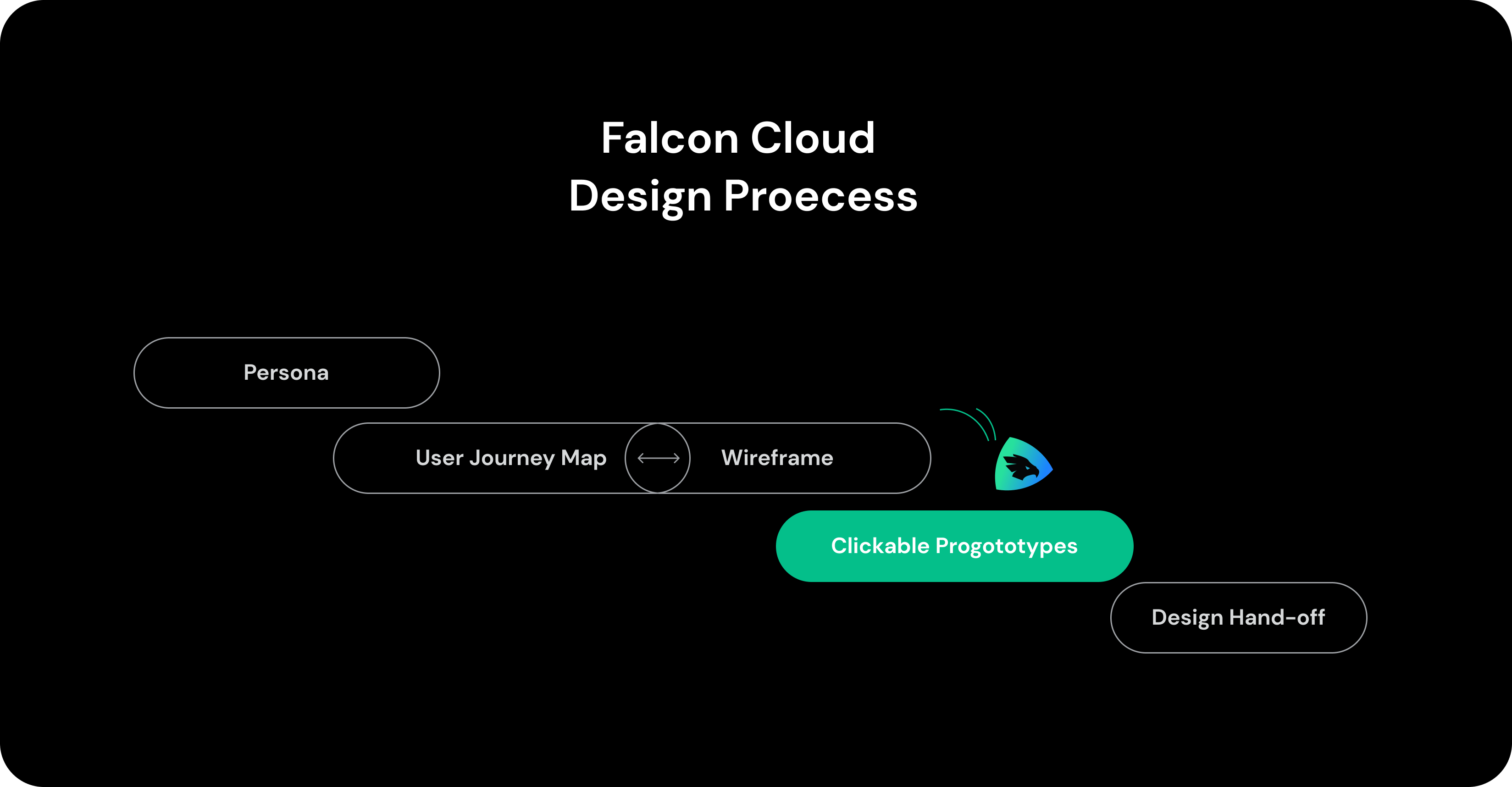
How we started
The Falcon Cloud 3.3 design began with persona research and a lot of scrum meetings. Thisled to the creation of user journey, wireframe, hand-off, and ultimately, a well-thought-out additions to the Falcon product suite lower the barriers to adoption, and unlock powerful collaborative workflows.
Skip to the final outcome

DISCOVER
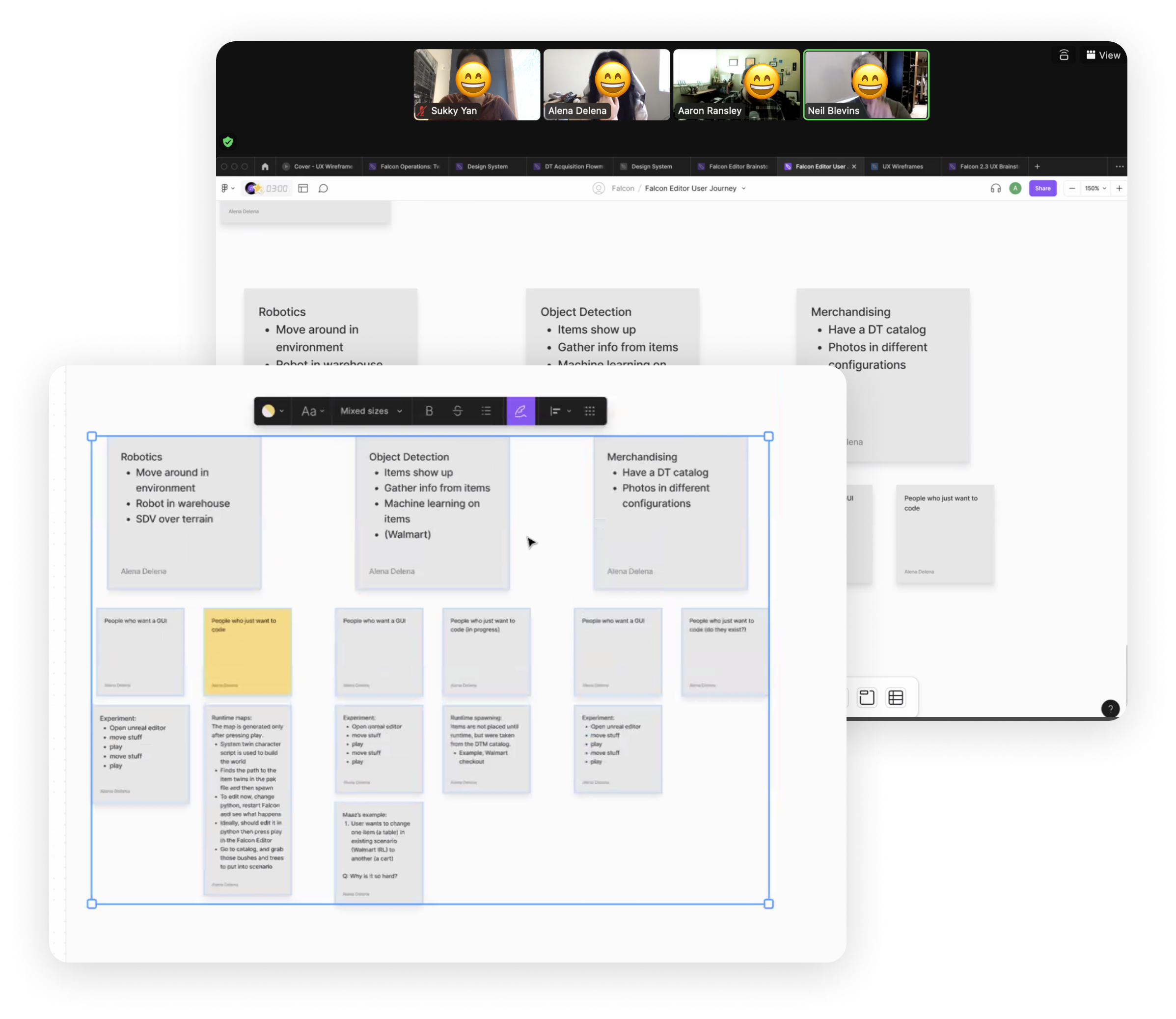
Persona
Starting with a persona brainstorming session with our internal stakeholder, the 3D Artist Director, we quickly mapped out three scenarios users might engage in with our product: Robotics, Object Detection, and Merchandising.
Who are they? Why they use? What they need?
I delved into the possible actions these three types of users might take to detail their needs. I was able to refine user needs and ensure our product meets their specific requirements.
DEFINE
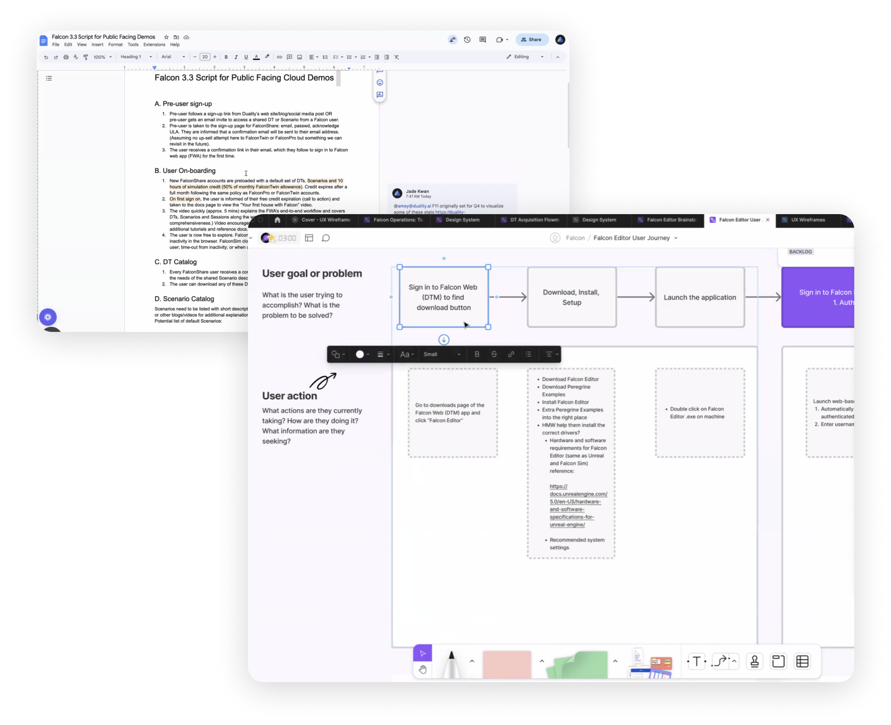
Map User Journey ( a lot of back and forth)
Designing the user flow is the most significant and time-consuming process during development. Based on the user script provided by the product manager and the personas I created, I mapped a user journey that outlines each step users encounter in Falcon. This process involved numerous iterations, including several scrum meetings and extensive feedback sessions on FigJam.

DESIGN
Visualize the ideal user flow
After confirming the user flow, I started sketching wireframe to present how to organize different components. Both managers and developers came in at this stage to ensure business and technology feasibility.
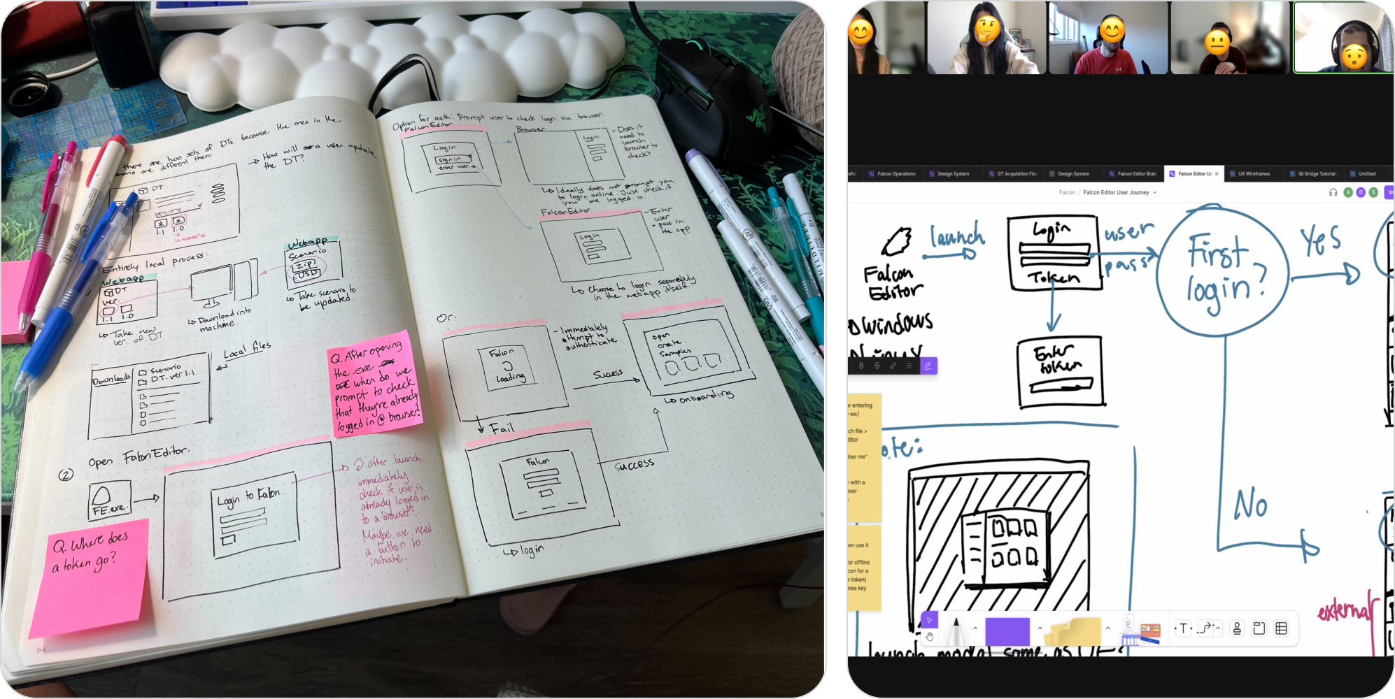
Iteration
Wireframing
Since we were designing on the basis of Falcon 3.2, I directly started from hi-fi wireframe, working with visual designers to deliver possible new components, and ensure we stayed consistency without interrupting existing user experience.
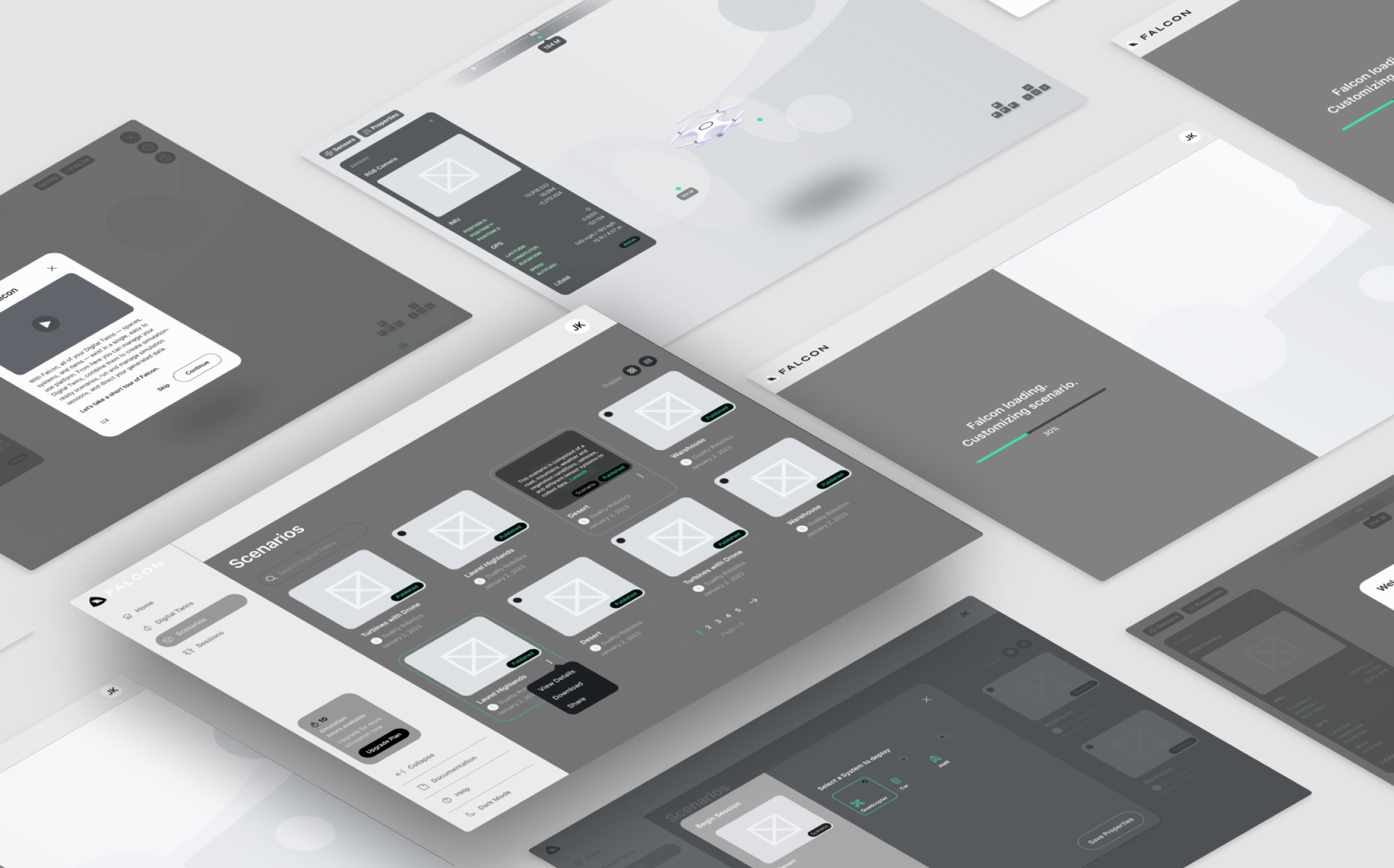
Iterated Wireframe
I communicated with engineers at this stage to ensure the accurate interaction and user flow update by design specs and scrum meeting. Since we have upgrade plans, we also included marketing team inside to work with the tier ideas.
DEPLOY
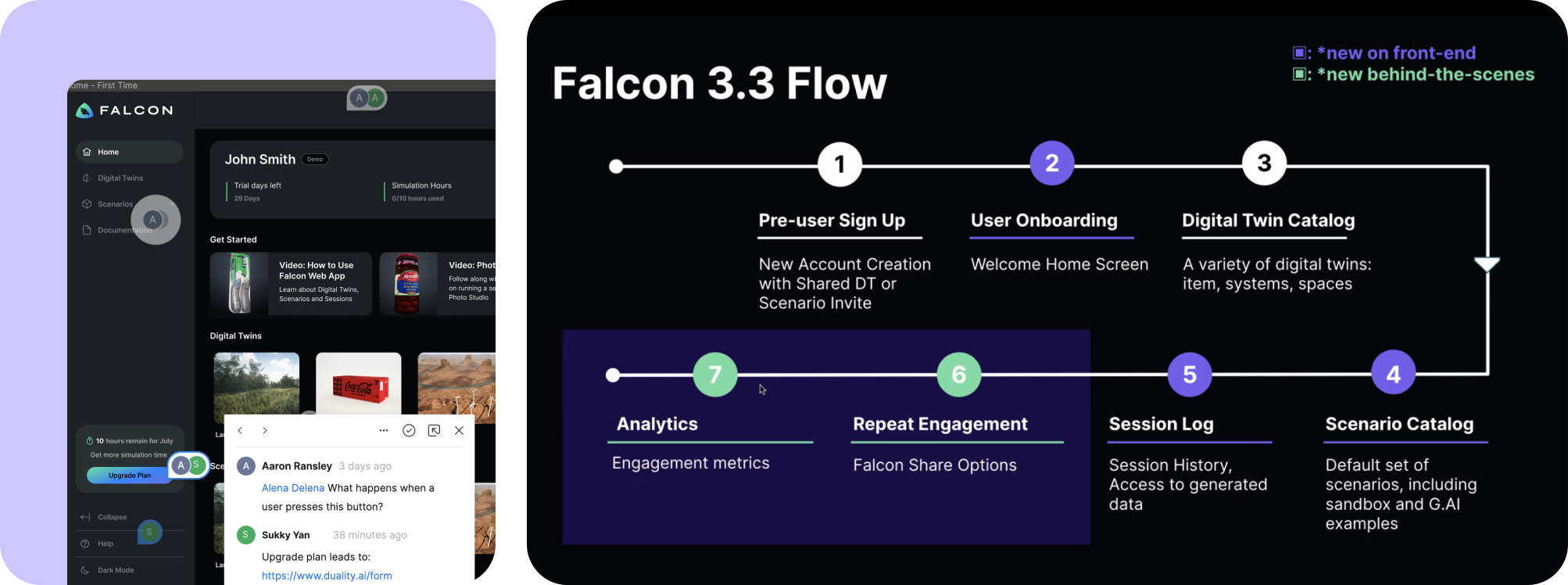
Pre-user Sign Up
We created two CTA widgets to highlight the new FalconCould Plans, allowing team members to engage with Falcon on different levels.
Transparent Onboarding
Empower first-time user to learn Falcon quickly through Intro-video, and accessible Help section on the left side bar.
Intuitive Session Run
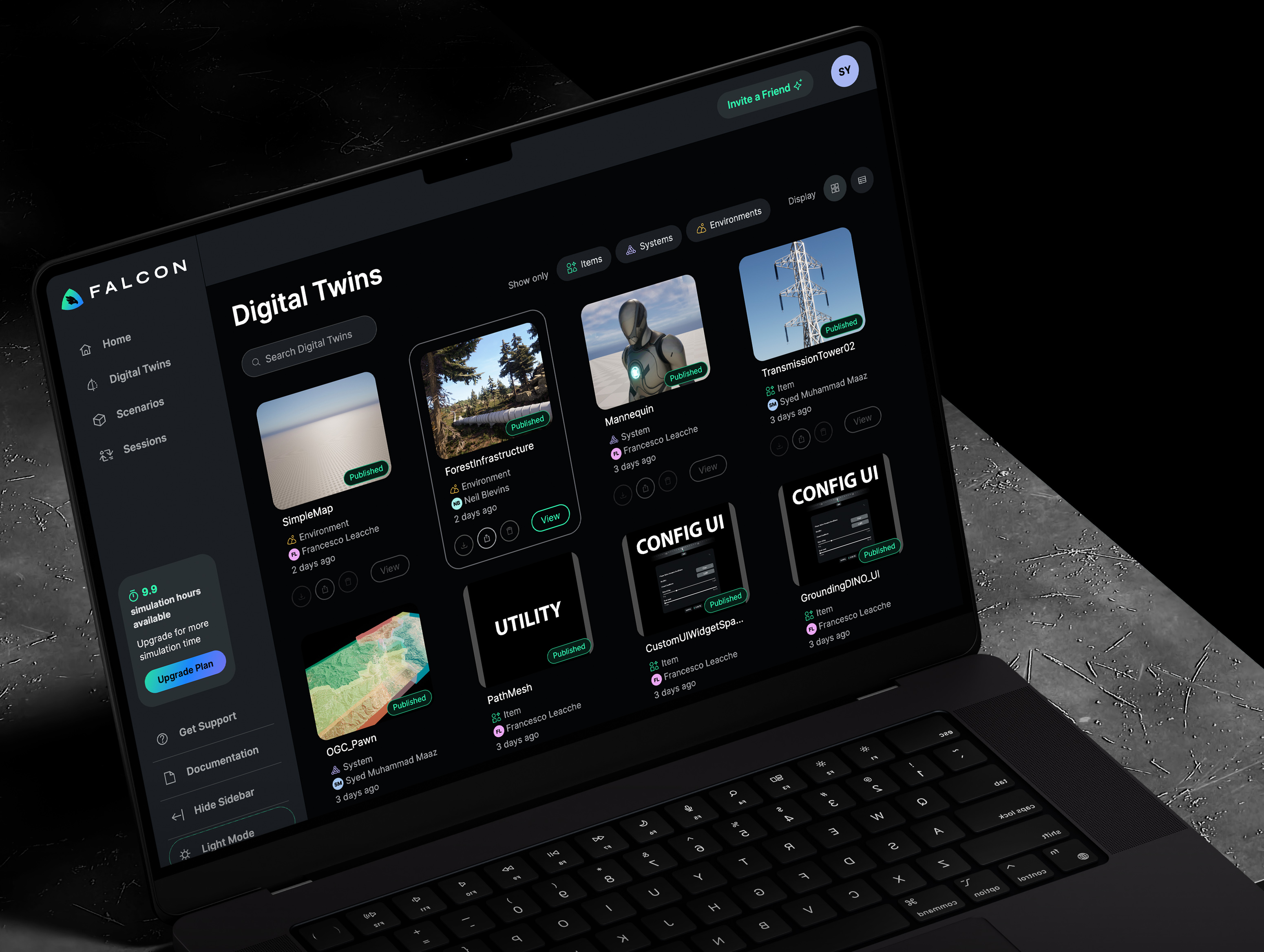
Sessions can be easily launched through the Scenario Catalog without complex hardware or specialized knowledge.
Highlighted Feature
Pricing Tiers to increase conversion
We created two CTA widgets to highlight the new FalconCould Plans, allowing team members to engage with Falcon on different levels.

